Showing posts with label still life. Show all posts

Friday, March 26, 2010

Shadow tryptich

Acrylic on canvas
50 x 50cm
A class exercise from last semester, we were instructed to produce a tryptich, be graphic, experiment with shadows and use a limited palette with increasing amount of colour from one section to the next. I have played with shadows before in some of my other still lifes and I do like the way they can extend the image. I initially drew up a more typical division of the canvas to create a tryptich but found it uninspiring. I am pleased with the torn paper effect.

Saturday, December 13, 2008

Pot study #12
12.5 x 12.5cm; 5 x 5"
.005 Micron pen

Tuesday, May 06, 2008

Pot study #11
Pen and wash on cold press water colour paper

Friday, May 02, 2008

Pot study #10
5 x 5 inches
.005 micron pen on cold press, watercolour paper

Friday, April 25, 2008

Pot study #8
5 x 5 inches

Pot study #9
5 x 5 inches
pen and wash on cold press water colour paper
I'm still inspired by the possibilities of these pot arrangements. At the textile forum I attended in Orange last week, I purchased these beautiful sea-urchin-shaped vessels. Handling them gives one the magical feel of finding a whole, unbroken sea-urchin but actually they are knitted, stiffened and rolled in sands of different colours by textile artist Jane Whitten who I will link to when she has a web site.

Thursday, April 03, 2008

Pot study #7
5.5 x 5.5"
Micron pen and water colour on water colour paper

Continuing my 'pot studies' and mindful of this week's Illustration Friday theme, 'homage', I got out my monster vase - a wonderful $5 worth from the charity shop - and set a small white pot in front of it. Playing around with shadows again, I noticed the reflection of the small pot on the larger one - and indeed a reflection of the larger pot off the ground back on to itself. Difficult to render but worth a go. I couldn't resist using colour this time.

Tuesday, April 01, 2008

Pot study #6
5.5 x 5.5"
micron pen .005 on cold press water colour paper

I've solved my difficulty with 'morning pages'. I don't like the idea of writing screeds and then falling under the proverbial bus and having some one else come along and read them. Nor do I like the idea of throwing them straight away. But writing small, and overlapping lines straight onto an art work makes lovely texture, don't you think!
As you can see, I'm having fun with these pot studies -focussing on using composition and playing with shadows to create an expressive piece.

Monday, March 31, 2008

Pot study #5
5.5 x 5.5"
Micron pen .005 on cold press water colour paper

Sunday, March 30, 2008

Pot study #4
5.5 x 5.5"
micron pen .005 on cold press water colour paper

Wednesday, March 26, 2008

Pot study #3

Micron pen on cold press water colour paper

7.5 x 7.5 inches

Tuesday, March 25, 2008

Pot study #2
Micron pen on cold press, watercolour paper
7.5 x 7.5 inches
This is my second attempt at this arrangement - I learnt to check the composition very carefully before beginning, because it's difficult to change things halfway through.

Saturday, March 22, 2008

For a while, I have been intending to take a closer look at, and be inspired by, the works of Giorgio Morandi. He mostly painted arrangements of pots and boxes in muted colours. The compositions are very unusual, often a central arrangement with the tops of the pots nearly aligned. He also did beautiful etchings with detailed crosshatching.I purchased a variety of small, old pots from a charity shop and made a 'corner box' out of a sheet of foam core board to isolate my arrangements as well as project shadows, which Morandi often eliminated, but I find very interesting.But the colours were too distracting, so I painted many of them white. This felt like dressing them in school uniforms but, unlike uniforms, the white had the effect of enhancing their form and individuality.I played around with them for a while and did some drawings. But I didn't achieve whatever it was I wanted. I have recently been working with a beautiful blue piece of fabric - and wanted to continue working in colour so I roughly over-painted some of the pots.
... and set up an arrangement, again with the spotted scarf, in the corner box. I painted with water colour, 6 1/2 inches square - and, playing around with the computer cropping, realized that the importance of the shadows is enhanced if the blue pot is cropped on the right. - still, it looks a bit clumsy.I tried again, this time without the scarf - and experimented with text as texture and to provide a 'base'.Then I thought I'd try machine embroidering it. I should have experimented with thread colour swatches before starting, as even a 4x4 inch piece like this takes several hours to stitch. In the event, most of the threads I had, turned out to be too frail to use for such dense stitching. In this medium, the blue pot looked uncomfortably chopped off - but it's easy to just place a bit of extra backing in the right place and add to the design.
Still life
4 x 4"
These are some pots that won't be over-painted as I really like their 'outfits'. Watch this space for more pot studies.

Monday, March 20, 2006


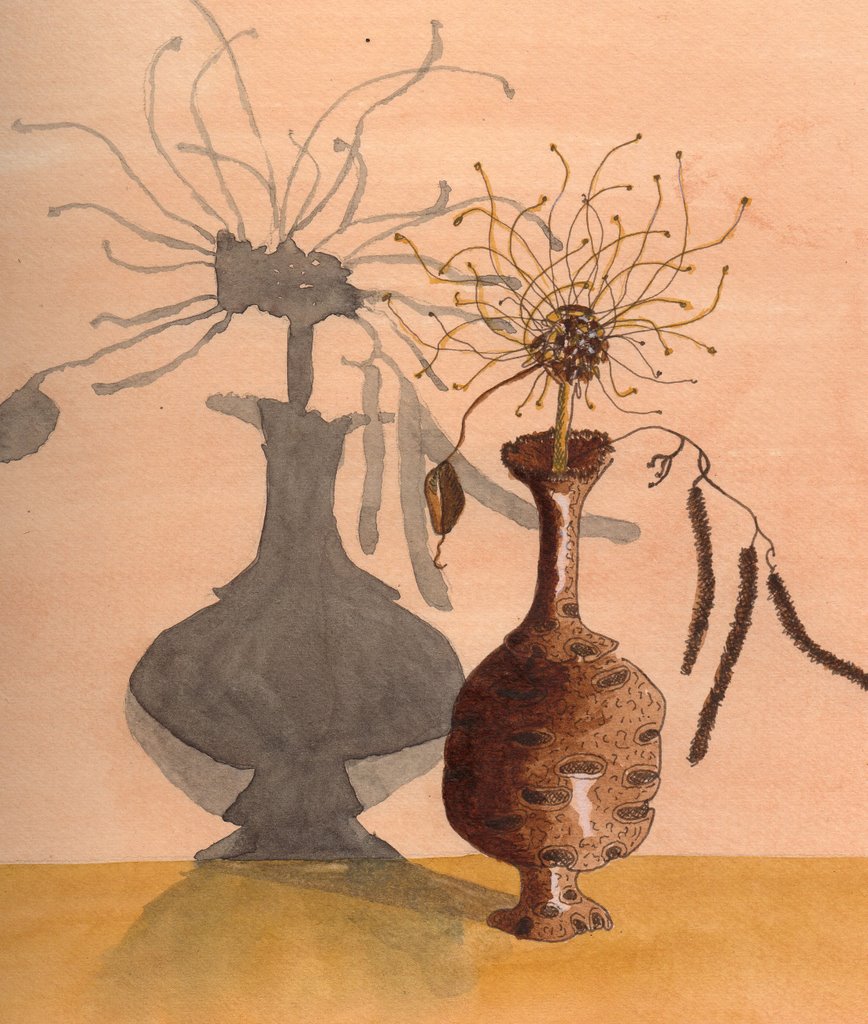
EDM Challenge#59 Signs of Autumn.
Ink pen and watercolour.

Nothing very autumny is happening in my garden as most of my plants are evergreens and I have already pruned the seeds or fruits away. However, I found the remains of an agapanthus seed head and a silver birch catkin. The vase is a turned banksia nut.
Actually Autumn here is a time of renewed invigoration for me as the drying days and oppressive nights are left behind, replaced by crisp mornings and cycling/bushwalking/doing weather.